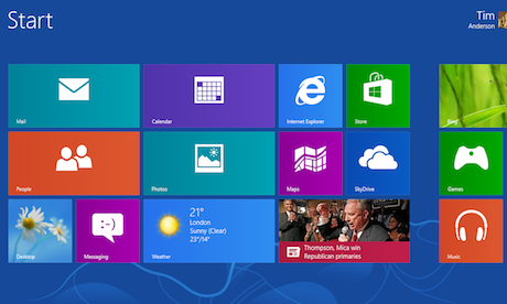
Windows 8 RTM Start screen: the spacing between icons has been tweaked from the previews
Microsoft has now made the release build of Windows 8 available to developers and IT administrators with subscriptions. The empire strikes back, or the beginning of the end for Windows?
It could be either. Windows 8 has had a mixed reception from those who have tried it in preview, with complaints mainly focused on the awkwardness of combining what often feels like two different operating systems into one. Microsoft has consciously made it hard to stay in the familiar Windows desktop environment and ignore the new-style "Modern" user interface, formerly known as Metro, which is optimised for touch control. There is only one Start menu, and it uses the Modern UI, while common files types such as images and PDF documents open by default in Modern apps. It makes for a jarring experience, especially if you have a laptop or desktop PC rather than a tablet.
The release version of Windows 8 is not radically different from the previews, but there are some new things. The translucent window effects of the Aero theme in Windows 7 have gone, replaced by a blander, squarer look more in keeping with the Modern UI. The Windows 8 Store is coming to life, and a few paid-for apps have appeared, though the number should increase sharply by the time of general retail availability on October 6th. Currently it is still sparsely populated, though there are a few stand-out apps such as Weather and Finance. Note that while the Store only includes Modern UI apps for install and update, it also has links to external sites for selected desktop apps.
A new start
One cosmetic but welcome change is in the way shortcuts for desktop applications appear in the Start screen. In the preview, each one was a tiny icon surrounded by a big block of wasted space. There is still plenty of wasted space, but the icons are now bigger and centralised, improving their appearance (see screenshot at top).
Microsoft has also been busy fixing bugs and fine-tuning performance. Windows 8 has demonstrated solid improvements over Windows 7 from the first preview, and the release build feels solid and brisk. Microsoft mentions several specifics: faster disk access yielding 10-20% speed-up in operations such as installing large applications; up to 35% faster resume from hibernation; much faster graphics and text rendering thanks to hardware acceleration, ranging from around 40% faster decoding of JPEG images to 438% faster drawing of rectangles, and much quicker Wi-Fi reconnection.
What this means for desktop users is that if you can learn to live with occasional Modern UI inconveniences, it is hard to go back to Windows 7 – which feels distinctly slower on the same hardware.
What this means for desktop users is that if you can learn to live with occasional Modern UI inconveniences, it is hard to go back to Windows 7 – which feels distinctly slower on the same hardware.
In transition?
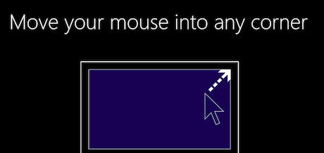 Windows 8 now has a tutorial for new users
Another key question is whether Microsoft has done enough to get users past their initial disorientation. The main difference compared to the previews is the appearance of new animations at the end of the Windows 8 setup. "After your PC is ready move the mouse into any corner," says the animation aimed at keyboard and mouse users, while there is a similar effort to encourage users to swipe in from the sides if using a tablet. This is minimal though, and many will need a more detailed survival guide. Some issues, notably the existence of two versions ofInternet Explorer, are long-term annoyances.
There are signs that Windows 8 is a transitional operating system. Even if you like the Modern UI and want to work in it as much as possible, the desktop is unavoidable for some tasks, and operations - say, safely removing an external USB drive – are awkward when there is no mouse available. Go to personalise your desktop, and you will find that while the colour selection dialog is touch-friendly, the Sounds control applet is little changed from Windows 7 and awkward without a mouse. Windows has always had its share of design inconsistency, but this is the most extreme in that respect.
Things to like
Along with the niggles, there is plenty to like. Installing and updating apps from the Store is delightfully easy, and safer than running third-party installers for desktop apps. The process of purchasing music or renting a video is similar to what we have already seen from Apple, Amazon and Google, but having this fully integrated with the operating system and with the same Microsoft account you use to sign into Windows does make it more seamless to use.
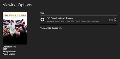 Windows 8 lets you buy or rent videos as easily as in iTunes or on Android, for multiple devices including PC, Xbox and Windows Phone.
Behind the Modern UI distractions there is a big and impressive vision. For the consumer, it involves bringing together cloud, PC, tablet, Xbox and Windows Phone so that your content is available across all devices (within reason – no Office documents on Xbox), and getting settings like social media accounts and internet favourites (aka bookmarks) roam with you. The pitch to businesses is about migrating to a world of personal, touch-controlled mobile devices without losing the security and manageability Microsoft has developed for Windows PCs. Note that the forthcoming Windows Phone 8 is built on the same kernel as Windows 8, and with a similar developer platform.
Microsoft's Office suite also has a key role, differentiating Windows 8 tablets from those running Apple iOS or Google Android, and enabling tablet users to do almost all their work without unpacking a laptop.
Conclusion
Report after report shows that the Windows ecosystem is hurting, and not only because of global recession. Macs at the high end, and Apple's iPad and iPhone, and Google Android in mobile, are eroding sales of PCs and laptops.
Windows 8 is Microsoft's answer, and it is good work. The Modern UI environment is not only enjoyable for touch users, but also fixes many long-standing Windows problems around security, performance, and ease of use. Combine it with cloud services including the Windows Store, Office 2013 and Office 365, SkyDrive and Skype, and you can see that all the pieces are there.
Windows 8 is Microsoft's answer, and it is good work. The Modern UI environment is not only enjoyable for touch users, but also fixes many long-standing Windows problems around security, performance, and ease of use. Combine it with cloud services including the Windows Store, Office 2013 and Office 365, SkyDrive and Skype, and you can see that all the pieces are there.
On the other hand, Microsoft is late to the tablet game – very late. App developers busy creating apps for iOS and Android will not rush to port to Windows 8 Modern UI until they see a strong market, and in that context the last thing Microsoft needs is Windows diehards devising ways to stay permanently in the desktop world, or vowing to stick with Windows 7, and there will be plenty of both.
All this makes the fate of Windows 8 and its ecosystem a tough one to call. What is certain though is that if Microsoft had merely offered a refined, improved and faster Windows 7, the continuing decline of Windows would have been assured. Windows 8 is bold and different, and underpinned by solid technical improvements. Yes, it is confusing and inconsistent, needs more apps, and is tricky for existing Windows users getting started; but it is also the most capable tablet operating system out there and a useful upgrade for desktop users. Don't dismiss it.
Availability
Windows 8 is available from August 15th for paying members of MSDN and TechNet, Microsoft's developer and IT administrator subscriptions, and from August 16th for enterprises with Software Assurance. It will be available to purchase as part of business volume agreements from September 1st, and from October 6th for consumers and pre-installed. System requirements are 1Ghz processor, 1GB RAM (2GB for 64-bit), and a graphics card that supports DirectX 9.
Gallery
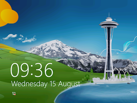 The Windows 8 lock screen
Windows 8 is now available in its release build to Microsoft subscribers.
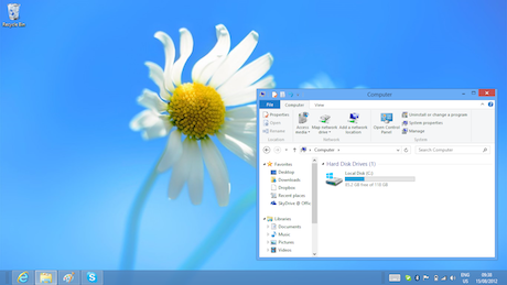 No Aero transparency on Windows 8
The Windows 8 desktop no longer supports "Aero" translucency.
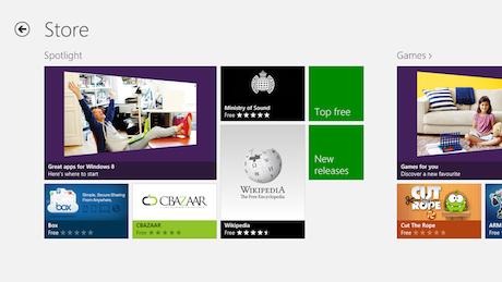 The Windows 8 store is filling up gradually
The Windows Store is still sparsely populated.
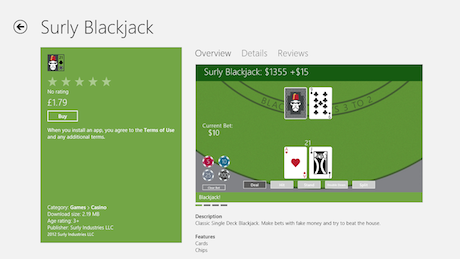 ...some apps are appearing in the Windows 8 store
A few paid-for apps have appeared in the Store.
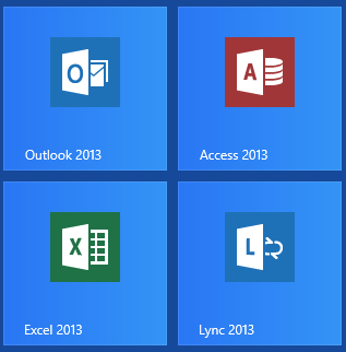 The Windows 8 legacy Start screen
Desktop apps have better Start tiles than in the preview, but still waste space.


